ClusterCompare
A tool to visualize software modularizations
and compare them to multiple clustering results
A tool to visualize software modularizations
and compare them to multiple clustering results
Classes of software products are coupled in different ways, for example:
These metrics indicate how the software product could or should be modularized. A clustering algorithm transfers them into hierarchical structures that could be used as package structure.
However, there is always an already existing package structure. ClusterCompare allows you to compare the existing structure to the clustering results.
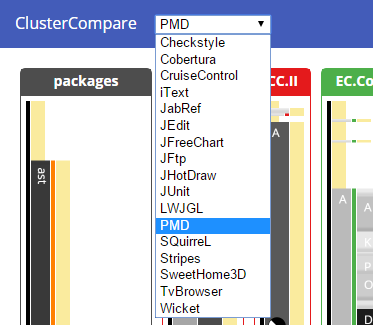
At first, you need to select one of the available software projects.
Open the combo box at the top left corner and click on a project.
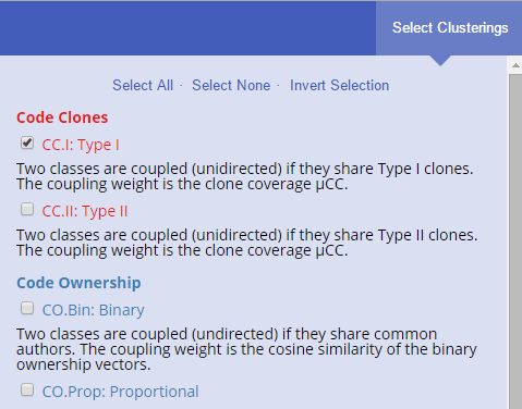
Initially, a predefined set of clusterings is selected. To add or remove clusterings, click on the button at the top right. The clusterings are grouped by their origin, and a short description is given for each.
Check the clusterings you want to be shown. You can also use the links at the top to modify the selection. Then, click the Apply button at the bottom and your selection will be applied. Finally, close the clustering selection by clicking on Select Clusterings, again.
You can rearrange the clusterings by dragging their title bars.
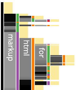
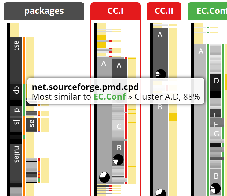
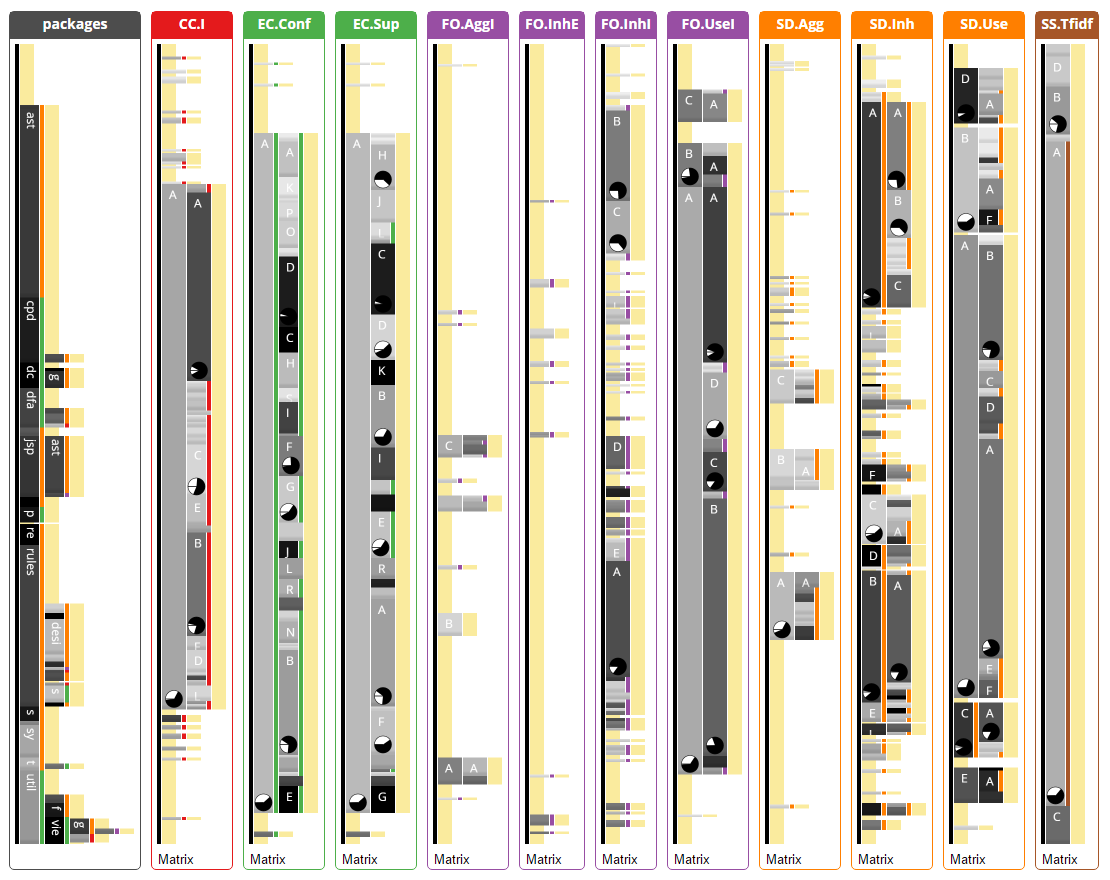
The hierarchies are visualized as icicle plots.
You read them from left to right: the thin black vertical line is the root node. The next column contains first-order packages/clusters, then there are their subpackages/subclusters and so on.
The shorter, yellow rectangles are class nodes.

The background color of nodes shows their similarity to other nodes.
For cluster nodes, the most similar package node is identified, and the background color shows the similarity between both. For package nodes, the most similar node in any of the clusterings is used.
Black or dark gray means high similarity, light gray is low similarity.
As similarity metric, the Jaccard Coefficient is used.
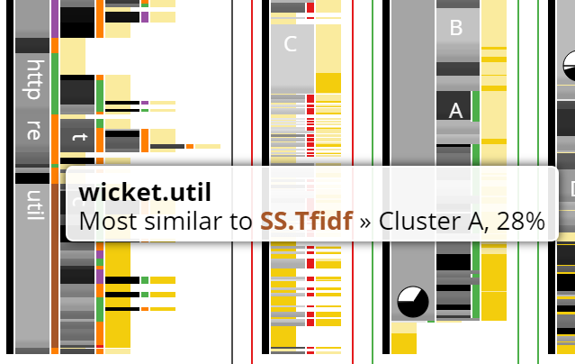
The color bars beside each node is the winner's color. You'll find the color in the header and border of the clustering that contains the node that is most similar.
Hover over the node to show a tooltip mentioning not only the most similar cluster's label, but also the exact similarity value.
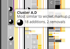
If there is no exact match for a node, the most similar node either contains additional classes or is missing some. To find out which of these reasons is dominating, look at the pie charts.
The chart is divided into a top half and a bottom half. The top half shows the number of additions in relation to the total number of classes. The bottom half visualizes the removals.
If the node is too small, the pie chart is not displayed in the icicle plot. Instead, hover over the node to see it in the tooltip.
Clicking on nodes selects the contained classes. They will be highlighted in blue in all clusterings, and the class names will be listed in the sidebar at the top.
You can add classes to the selection by Ctrl-clicking. If the clicked node is already fully selected, its classes will be removed from the selection.
Hovering over a node triggers a secondary selection which darkens the color. Hover selection and main selection can be combined.
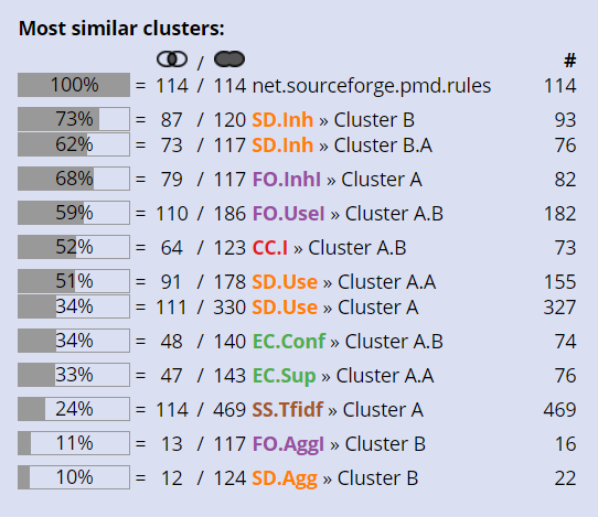
The bottom part of the sidebar lists clusters and packages that are most similar to the set of selected classes. You can hover over the items to highlight the classes.
The first column displays the Jaccard coefficient as bar chart. The second column shows how many classes are shared by selection and cluster (the intersection), the third column is the number of classes in total (the union). The quotient of both is the Jaccard coefficient. The last column shows the number of classes in the cluster.
You can view the source code of a class by clicking on a class name in the top part of the sidebar.
The source code of this project is hosted on GitHub and available under the MIT license.
Feel free to submit improvements or use the code for your own experiments.
This tool has been developed within the scope of a Bachelor's thesis at the Visualization Institute of the University of Stuttgart
and is part of the research paper Identifying Modularization Patterns by Visual Comparison of Multiple Hierarchies
submitted to the 24th IEEE international conference on program comprehension.